
The Bitcoin Rainbow Chart is a logarithmic graph that visualizes the historical price movement of Bitcoin and provides a potential trajectory for its future price based on past trends. We at Coincipher believe the Rainbow Chart is a valuable tool for understanding Bitcoin’s long-term growth and market cycles.
Summary
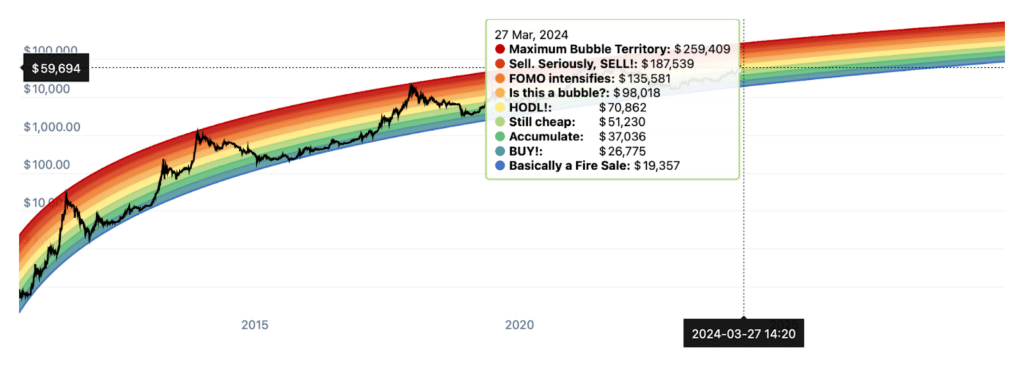
The Bitcoin Rainbow Chart overlays colored bands onto Bitcoin’s price plotted on a logarithmic scale. The bands follow a mathematically calculated regression curve that fits Bitcoin’s historical price movement. The colors represent different phases of market sentiment, from undervalued to overvalued, giving insight into potential accumulation and selling opportunities. While not investment advice, the Rainbow Chart provides an intriguing perspective on Bitcoin’s adoption cycle and value proposition.
What is the Bitcoin Rainbow Chart?
Rainbow Chart shows Bitcoin’s price increasing at a decreasing rate over time as adoption grows and volatility decreases. The logarithmic price scale allows the chart to depict Bitcoin’s orders of magnitude price increases while the regression curve centers the price movement.
The rainbow color bands are divided into nine phases based on the regression:
- Blue – Deeply undervalued
- Light Blue – Undervalued
- Light Green – Slightly undervalued
- Yellow – Fair valued
- Light Orange – Slightly overvalued
- Dark Orange – Overvalued
- Red – Significantly overvalued
- Dark Red – Extremely overvalued
- Maximum Bubble Territory
How to interpret the Bitcoin Rainbow Chart?
The Bitcoin Rainbow Chart is a tool that can help gauge the overall market sentiment and potential future price trajectory of Bitcoin. Here’s how to interpret the different color bands:
- Blue and Light Blue: These colors indicate that Bitcoin is undervalued based on historical trends. It could be a good time to accumulate Bitcoin for the long term.
- Light Green and Yellow: When the price is in these bands, it suggests that Bitcoin is fairly valued. The market sentiment is neutral.
- Light Orange and Dark Orange: These colors hint that Bitcoin might be slightly overvalued. If you’ve already invested, now could be a good time to consider taking some profits.
- Red and Dark Red: When Bitcoin’s price is in these upper bands, it indicates a significantly overvalued market with high levels of hype and FOMO (Fear Of Missing Out). Historically, these have been good times to sell.
- Maximum Bubble Territory: This suggests the peak of a bubble and that a major correction could be imminent.
It’s important to note that the Rainbow Chart is not a definitive trading tool. It provides a general sense of Bitcoin’s valuation based on historical trends but should be used with other market indicators and analysis.
For those interested in other aspects of the blockchain and cryptocurrency space, you might also want to explore:
History and Significance
The concept of a logarithmic regression curve for Bitcoin’s price was first proposed in 2014 by a user named Trolololo on the Bitcointalk forum. This early version provided the foundation for the Rainbow Chart used today.
Many variations of the chart have circulated over the years as Bitcoin has progressed through multiple market cycles. The most well-known Rainbow Chart is maintained by blockchain analytics company Blockchaincenter and is regularly updated with new price data to refine the regression curve.
The Rainbow Chart has gained popularity in the Bitcoin community as a big picture visualization of market cycles and a fun representation of the crypto’s potential future. While some may use it to time market entries and exits, the chart is not meant to be strict trading advice. Instead, it provides a zoomed out perspective on Bitcoin’s adoption curve and value proposition.
Relating to Bitcoin Halving Cycles
Interestingly, the Rainbow Chart highlights how Bitcoin’s price has moved in relation to its halving cycles. Bitcoin’s supply issuance is cut in half every 210,000 blocks mined (roughly 4 years), resulting in increased scarcity.
Historically, Bitcoin’s price has been in the undervalued lower bands of the Rainbow near the time of the halvings before climbing to overvalued territory over the following years. This has led to narratives around the 4-year Bitcoin cycle corresponding with the Rainbow bands.
However, Bitcoin’s growth trajectory is still emerging with only a limited sample size of market cycles. It remains to be seen how Bitcoin’s price will move in relation to the Rainbow and halvings over the coming decades.
Limitations and Critiques
It’s crucial to understand the Rainbow Chart’s limitations. The model uses historical price as inputs for the regression curve but doesn’t account for future changes in demand, regulations, macroeconomic factors, or black swan events.
Some critics argue the Rainbow Chart depicts an overly optimistic view on Bitcoin’s future price potential that isn’t rooted in fundamental analysis. The chart doesn’t provide insight into intra-cycle volatility either.
Ultimately, the Rainbow Chart is best used in conjunction with other market and on-chain indicators. It provides a high level view to conceptualize how far Bitcoin has come and how much further it may grow.
Conclusion
The Bitcoin Rainbow Chart offers a visually compelling way to track Bitcoin’s price through market cycles on a logarithmic scale. The color bands and regression curve synthesize historical price data to map Bitcoin’s potential trajectory and gauge market sentiment.
However, the Rainbow Chart has limitations and is not meant as investment advice. We believe it is a valuable part of a holistic approach to understanding Bitcoin but should not be the sole basis for financial decisions.
FAQs
Is the Rainbow Chart a good tool for timing Bitcoin buys and sells?
The Rainbow Chart is more of a fun visualization than a precise trading tool. The color bands can provide a general sense of whether Bitcoin is undervalued or overvalued based on historical trends, but should not be the sole basis for timing trades. Combining the Rainbow Chart with other indicators and risk management strategies is advised.
Who created the Bitcoin Rainbow Chart?
The concept was first proposed in 2014 by a Bitcointalk forum user named Trolololo. Since then, many versions have circulated with the most popular one maintained by Blockchaincenter.
How often is the Bitcoin Rainbow Chart updated?
Most versions of the live Rainbow Chart update daily or weekly with the latest Bitcoin price data to refine the regression curve. However, the general trajectory tends to stay fairly consistent through market cycles.

